Website & Strategy
Web Design: The Influence of Colors and Typography on Conversion
February 2026
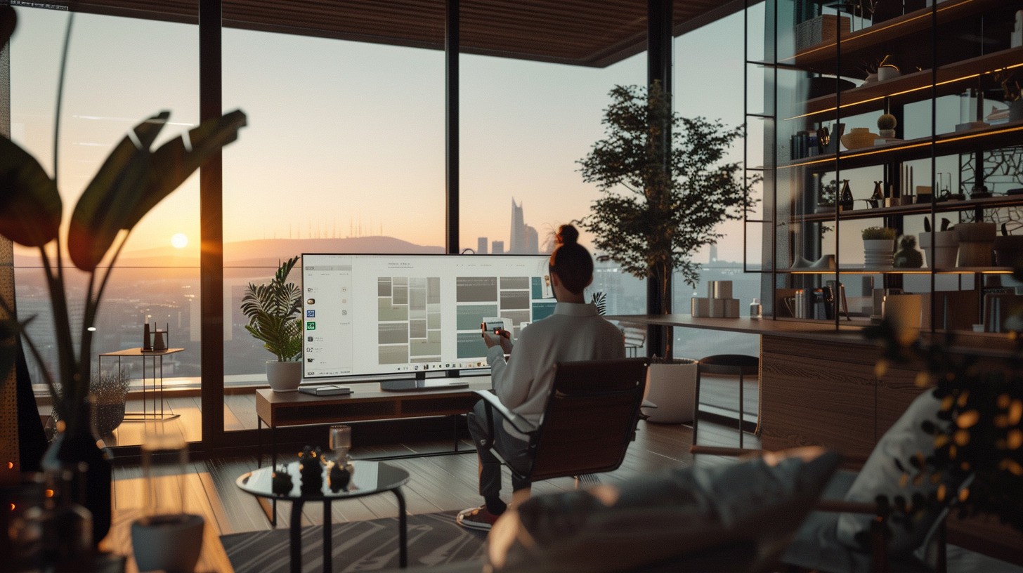
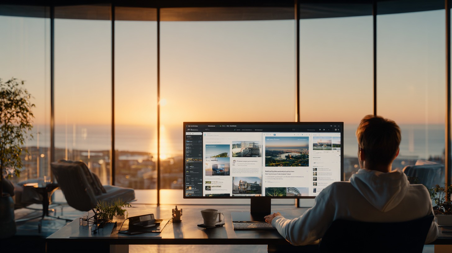
In the world of web design, aesthetics is never free. Every color nuance and every letter serif carries a subconscious message that dictates the behavior of your visitors. For a brand striving for excellence, understanding color psychology and the impact of site typography is essential to transforming a mere visit into a deep commitment to the brand image.
Color Psychology
Color is the first element perceived by the human brain, well before reading the slightest word. It triggers immediate emotions that influence perceptions of credibility and value.
Blue: A symbol of trust, serenity, and professionalism. It is the preferred color for the finance, consulting, and technology sectors.
Black and Gold: The ultimate alliance of luxury and exclusivity. They evoke sophistication and high-end appeal, perfect for a Corporate-Luxury positioning.
White and Anthracite Grey: They embody minimalism, clarity, and modernity. They help structure space and allow your content to breathe.
Green: Associated with growth, balance, and sustainability. Ideal for brands that emphasize ethics or well-being.
Strategic Tip: Use the 60-30-10 rule (60% dominant color, 30% secondary, 10% accent for your calls to action) to maintain a perfect visual balance.
Site Typography
If color sets the tone, typography defines the personality of your discourse. Choosing a typeface is not just a question of readability; it’s a matter of identity.
Serif Fonts: Like Playfair Display or Lora. They evoke tradition, authority, and seriousness. They are ideal for titles in a luxury or legal advisory context.
Sans Serif Fonts: Like Montserrat or Roboto. They project a modern, clean, and accessible image. They ensure optimal readability on digital media.
Typographic Hierarchy: An effective site uses contrasts in weights (bold/light) and sizes to guide the reader's eye. Your H1, H2, and paragraphs should form a logical and restful structure for the user.
User Experience (UX) and Accessibility
A successful design must be inclusive. The contrast between text and background is not just a matter of taste, but an ergonomic imperative.
Readability First: Avoid light text on a light background. High contrast reduces eye strain and increases time spent on your site.
White Space (Negative Space): Luxury is space. Do not overcrowd your pages. White spaces highlight your key elements (images, conversion buttons) and direct attention where it matters.
Visual Consistency and Brand Recall
Repetition creates recognition. Your color palette and typographic choices must be mirrored across all your digital media.
Style Guide: Document your choices to ensure total consistency between your site, your social networks, and your client presentations.
Emotion and Conversion: A visitor who feels "good" on a site due to visual harmony is statistically more likely to take action.
FAQ
How do I choose the color of my call to action (CTA) buttons? The color of your buttons should create strong contrast with the rest of the page. If your site is largely blue and white, an orange or coral button will immediately attract the eye. The goal is to create an irresistible visual "call".
Can we use more than two different typefaces on the same site? It is recommended to limit to two font families: one for titles (bold and distinctive) and one for body text (neutral and highly readable). Multiplying fonts creates visual confusion that undermines the seriousness of your brand.
Why is the expertise of 3DH Studio crucial for your visual identity? At 3DH Studio, we do not choose colors and fonts by mere instinct. We design graphic charts based on the analysis of your market and the psychology of your target audience. We create visual universes that enhance your values and optimize every pixel for conversion. Engaging us ensures a design that is not only beautiful but actively works for your success.